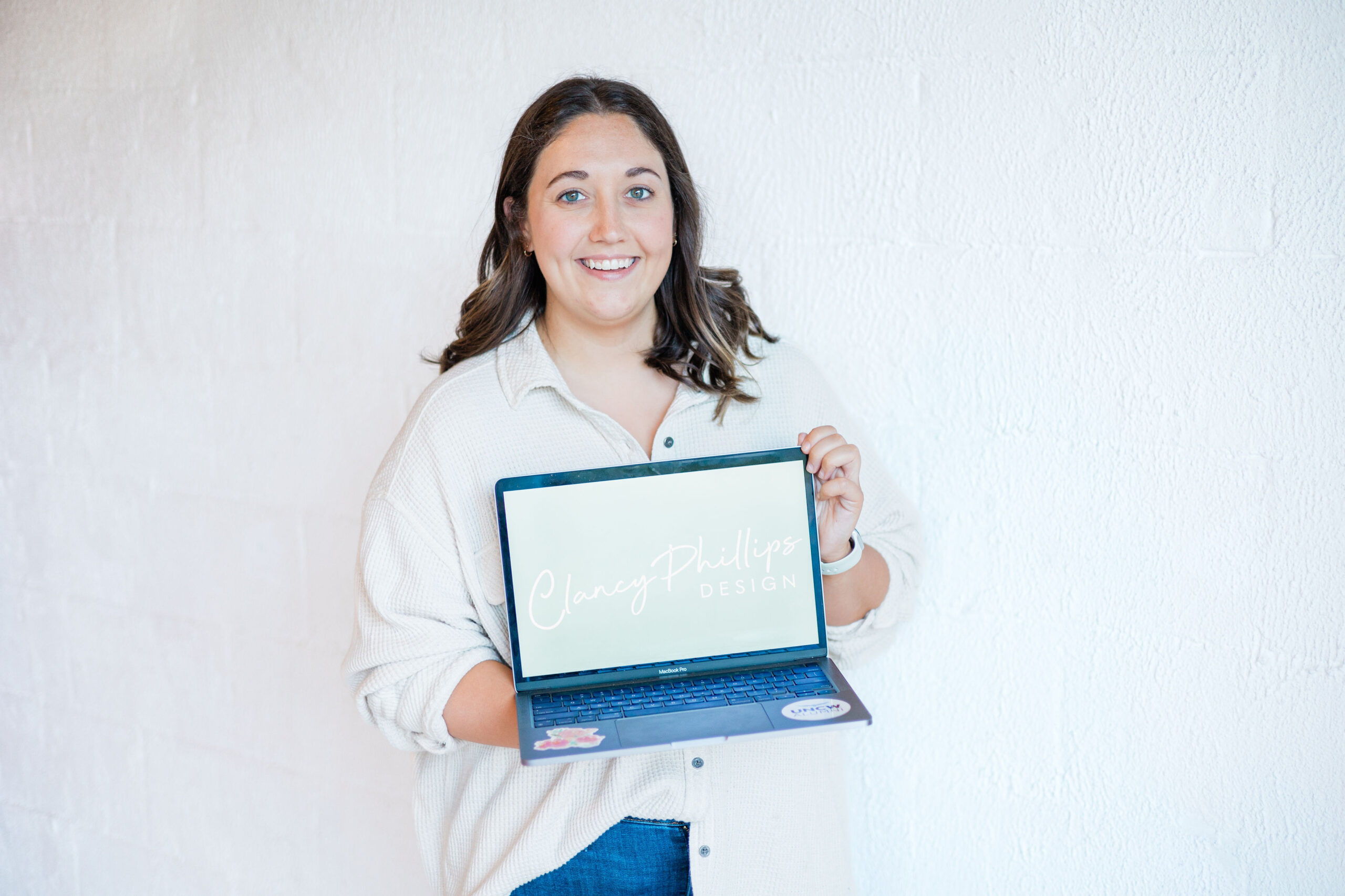

Welcome to the new chapter of my design journey! Over the past few months, I’ve been deeply immersed in reimagining my brand to better reflect my vision, values, and the exciting new services I’m offering. One of the most significant aspects of this transformation is the creation of a new logo. I’m thrilled to share the story behind this logo and how it represents the essence of what my brand stands for.
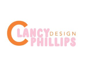
When trying to decide on this new chapter of Clancy Phillips Design, one of the first questions I asked myself was, “Do I want a new logo?” While I still loved my old one (pictured below), I felt like it might be too childish and keep some of my potential clients from wanting to work with me. A logo is a HUGE deal to a brand! 9 times out of 10, it’s the first impression a client or customer gets of your business! So, while I loved the bright colors and fun type…I decided it was time to go with something that was a little more professional.
I also wanted my logo to be able to grow with me and my business. So, I started brain storming — and let me tell you, it was not easy! I guess you could say I had some major design block. Yes, designers get that, too! That was until I found and read a very special letter.
For those that don’t know, my big brother died suddenly at the age of 30 in 2020. Some of my absolute most treasured possessions now are of some letters that he wrote to me. I picked one up to read near the anniversary of his passing in May and read these words, “Just remember, you probably already know this, but what’s most important is doing something “Clancy” enjoys, something that you don’t even consider labor and watch for the clock to tic past every minute of a day, instead you are wanting to stay after with over time and are as close as anybody can be to a workaholic.” *still gives me chills. This sentence stopped me in my tracks. This is the exact way I feel about design and my design business every time a new client contacts me or I am working on a design project. It’s my passion! It was exactly what I needed in that moment and gave me the push I needed to really go for it in my design business!
It was then that I knew that I wanted to incorporate my brother somehow in my logo. It was a way I could include him in my business and passion and also remind me of his words every time I look at my new logo. As I kept looking at that sentence, I noticed his handwriting (which was pretty good for a guy) and saw the pretty way he curved his “C”. I attached a picture of it below.
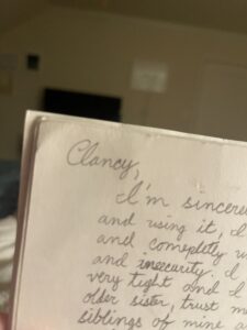
What is so special about the “C” is that it is what my niece and nephews (and now my whole family) call me. It was like a light switch went off and I knew that I would have to incorporate his “C” into my logo. It was like everything fell into place in that moment. Combining my family — the most important people in the world to me — in my logo felt so right.
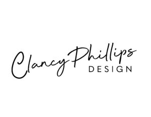
After that, I played around with some different colors but ultimately decided on black. This new logo is timeless, classic and professional, but still playful with the script that I found to match my “C” perfectly. It visually describes me and my brand perfectly (which is what everyone needs to look for in a logo!) Plus, I can still bring allll the color in my website! I look at this logo now and am instantly reminded of my brother and of my family and of why I am pursuing this dream. I encourage you all to find the thing that as Brody said makes you “as close as anyone can be to a workaholic.” So, without further ado, introducing the new logo of Clancy Phillips Design:
Thank you Brody, I love and miss you everyday.
I hope you all stick around, I am so excited about the future of Clancy Phillips Designs!
Clancy

Hi, this is a comment.
To get started with moderating, editing, and deleting comments, please visit the Comments screen in the dashboard.
Commenter avatars come from Gravatar.